Two years old in New Zealand - and a shiny new catalogue to celebrate! If you preordered a copy and haven't received it yet it shouldn't be far away. If you hadn't preordered, there are still a couple of copies in the bottom of the box, available for $10. Please contact me if you would like one. In the meantime, the catalogue is now available online here, or click on the pretty picture over there on the side bar....>
Now to some random thoughts about the new catalogue....
- firstly, you may have noticed already that the 'recipes' for all the projects shown in the catalogue are nolonger listed in the back. They were apparently left out this time to make more room for goodies. Cannot really complain about that I suppose. The list of materials used is available as a separate file. Contact me if you would like it. I am also hoping that in the VERY near future it will be available on the SU website, at which time, I put a link over there with the catalogue.
- A few typos have been noticed. Annoying, but cannot be helped I suppose (afterall, last year that worked in our favour with super cheap papers all year!) Here is a list, and I am hoping I don't have to add to it in the coming days.
- Bugs and Kisses - p 60 - the ant is missing from the catalogue, but is still in the set.
- Dreams du Jour - p 80 - catalogue says it's a two step set, but it isn't.
- Good Friend - p 99 - a small heart is shown in the catalogue, but is not actually included in the set (but you could cut your own from the rubber scraps?!)
- In Color striped ribbon - p 126 - price is actually $22.95 (as listed on p 150)
- Bold Brights Classic ink pads - p 128 - price is actually $13.95
- Rich Regals Classic ink pads - p 129 - price is actually $13.95
- Soft Subtles Classic ink pads - p 129 - price is actually $13.95
- (earth elements, neutrals and in color ink pads were priced correctly - whew!)
- Love Notes - p 131 - everything was wrong for this one - actually called 'Love Notes', # 111861, priced $16.25
- On Board Loads of Letters -p 146 - incorrectly listed as 'lot's of letters' in catalogue
- designer label punch - p 152 - correct price is $35.95
- missed altogether - the 3/16th (4.7mm) corner rounder punch IS available. #109047, priced at $15.95
and I think that is it on the corrections!
- There are also some great new inclusions. Scattered throughout the catalogue you will find technique reminders - complete with photos and simple step by step instructions. I am also really pleased to see that the colours of the patterned papers are listed by each sample which makes coordinating your projects easier than ever!
- Overall the catalogue seems alot more in line with what is offered in the United States. We have got a lot of great new stamp sets, and also see the return of some favourites from the last spring and summer mini catalogues, as well as both the scallop punches - square and border, and six other new punches.
- Embellishments - what to say - yummy new buttons, brads, clips, ribbons, diecut and felt flowers, gorgeous new glitters, and some fantastic new 'sticky cut' shapes and letters to go with those glitters.... I am planning on organising some embellishment shares so you can sample them without having to spend a fortune - watch this space!
- Simply Sent card kits are back, but with a little difference that I am really liking. While there are a couple of the all inclusive kits (stampset, inks, card, embellishments etc) they have also included some 'mix and match' card elements. You can buy the stamp set and the card/embellishment kits seperately, which is much easier on the budget. Inks aren't included - you can use the ones you have, or just choose to buy the coordinating colour that you like.


 A hand bag.


 To start off the colour may appear patchy, but just keep going until it evens out.


 So last month it was Valentine's day. As well as the requirement for Hayden to bring a card for every member of his class, there was also the small matter of something for the teacher. She is a lovely lady, who had been really helpful in getting him settled in his new class, so we wanted to make her something special. So this is what we did. A simple little notebook from the $2 shop was transformed into something a little bit more special, with the help of some lovely Ginger Blossom patterned paper, card, and a few embellishments. Add in a matching pen, and boxy thing to keep it in, present complete. We were really pleased with how it turned out, and the teacher loved it. And all for under $5.
 Materials used for this project:
 Step One.
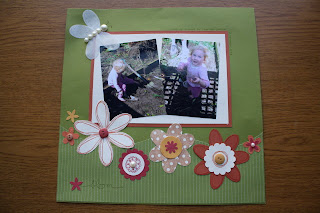
 journaling done!