Pages

Showing posts with label technique. Show all posts

Sunday, November 22, 2009

The Grown Up Version

So for the grown up version of this card (and this, the original one) I put the bug stamps away, and decided instead to use the big flower from the Eastern Blooms set.  The design of the card was exactly the same again, just the colours (this time tangerine tango, more mustard, so saffron and old olive) and stamps changed, and this time I left off the brads.


The tango squares were punched from crimped card, and I used the mat pack to piece around the edges of the mustard squares.  To add even more textural interest I added a fun centre to those flowers.  First I used my cropadile and punched holes in a scrap of saffron card.  Next I gathered up all those little punched circles.  They do come out with a slight bend in them, and usually I would flatten them off, but for this project I decided to leave them as they were, to help with the texture.  I decided that crystal effects would be the best adhesive to use and initially planned to put a blob on the centre of the flowers and then cover it with the saffron circles.  I discovered that although they were holding fine, it wasn't as easy to stack them all up in a pile, the way I wanted.  Since I was making this up as I went along anyway (are you surprised?!) I decided to turn these squares into textured, glossy tiles instead, by covering that little pile of saffron circles, and the rest of the stamped square too, in crystal effects.  This way you can still see and touch the textured centre of the flowers, with no risk of anything falling off, and the high gloss centre doesn't look out of place, because the entire square looks the same.


I really like the way the tiles, and indeed the entire card has turned out, and will definitely be adding this to my list of techniques to use again.

Wednesday, September 16, 2009

Embossed wallets - and some lessons

After showing you this wallet a couple of posts ago - I did manage to experiment with some embossing and I was really pleased with how it turned out.  It has taken me a few days to get the post up though - the kids got hold of the wallets, and put them in a 'safe place' before I had managed to take the photo.  Lesson 1 - take photos of your projects before the kids start playing. 
Originally there was only going to be one embossed brown wallet to show you - that one you see there on the left.  I love how this turned out.  I cannot remember where I first saw this technique - the lady was using it on a wonderful handbag project she was making (if you have seen this, and remember, please let me know so I can give her the credit!)
Anyway, it is easy to do - just apply versamark ink to your project (yep - everywhere you want the embossing to be), add the clear embossing powder, and then before you heat it up to melt it, scrape some squiggly lines in it - removing a bit of the powder.  This means that when you do heat it to melt the embossing powder, the squiggly lines will not be shiny, and you will get a bit of a leathery look.
Lesson 2 - make sure you clean out your powder pal properly between projects.  It was only after I embossed the first brown wallet, and noticed it had a bad case of sparkly dandruff, that I discovered just how 'contaminated' my clear embossing powder was. Bother.
Lesson 3 - if the kids see it they will want one as well - not a new lesson that one of course, but I will confess, one I had momentarily forgotten.  Luckily Campbell decided that he actually really liked the brown with sparkly dandruff wallet - but couldn't we please make the inside red?  Bridie of course wanted pink with shiny flowers. 
So, for that one we used one of the flowers from the Fifth Avenue Floral set, some gold ink, and some of that contaminated powder (no good for versamark on brown card, but actually still okay to use on white card, or with metallic/white ink).  It doesn't show up all that well in the photo, but take my word for it - it looked stunning.  Especially stuffed full of the paper money that we promptly had to make.  I think I want one for me - expect, with real money instead of home made!
Lessons 4, 5, 6 and 7?  Embossing is easy.  Embossing is fun (the kids were fascinated!)  You can heat emboss with a good old toaster, but to be honest, I think for a project like the brown wallets, where you are embossing a larger area, the heat tool is fantastic.  If you are embossing both sides of a project remember that the first side you do may 'remelt' a bit when you do the second side - don't have it laying on your benchtop etc when you do that (and no - I didn't learn this last one the hard way!)

Tuesday, July 7, 2009

Floating Water Colour 'Q and A'

Some explanation about these flowers from the last post, which were coloured using a 'floating water colour' technique...

What paper did I use?

All the lovely samples I had seen in my blog travels had used SU 'Shimmery White' paper, which, alas, is not yet available in NZ/Aust. So, I decided to go with water colour paper instead. I am really happy with how it turned out, especially as this was my first (and only, so far) attempt at this technique. I might try glossy white card next. Anyone tried that already?

Did I use Water or Aqua painters?

Both! After you have heat embossed your image spray it with water until the water is pooling inside each of the embossed sections. This is a very 'wet' technique, which is why I decided to go with the water colour paper rather than ordinary card. I then used my aquapainter to 'pick up' ink (drops from a reinker) and deposit it in the appropriate part of the embossed image. The ink should spread thoughout each section by itself. If you want a bit more colour variation you can add more than one colour to each section, and laying the card on an angle to dry will result in a gradient of colour too. Be aware, your project will take a little while to dry.

Sunday, July 5, 2009

Tango on Fifth Avenue

Tangerine Tango that is! This is a colour that I really like but hadn't had much of a chance to play with so far. That said, the card used is tango - the ink colours used for this cool floating watercolour technique were actually really rust and pumpkin pie - I didn't have a tango ink refill.

I think Fifth Avenue Floral may be my favourite stamp set from this catalogue - it was top of the wish list anyway, and is just perfect for this technique. I actually made the flowers a few weeks back - as soon as I got my hands on the stamps, but have only now gotten around to doing something with them. There was a little bit of dazzling diamond glitter in with the embossing powder but I think the hint of sparkle just adds to the magic of this look.

I teamed the Tangerine Tango up with Old Olive, using the now retired 'French Script' background stamp (current equivalent is 'En Francais') to stamp on vanilla card, with some sponging around the edges. Oval punches were used for leaves and the sentiment (from the 'Occasional Greetings' set). Old Olive ribbon and brads finished the card off nicely.

Yep. I am pretty sure that This is my most favourite stamp set - for today anyway!

Sunday, June 21, 2009

An accordian spine mini coaster book...

Once upon a time there was a boy who went to a cartooning class. The boy loved it, and wanted to spend almost every moment after that, designing, creating, and mass producing comic books, which he intended to sell to his family.... I am guessing that is just the first chapter of that story, rather than 'The End'!

For my part, I decided to make Hayden a special little coaster book, that he could turn into a limited edition Hayden Jones comic. These little books are easy to make, and a great way to use up those scraps. Some of you have done them in a class or workshop with me before.
When it came to decorating the covers, I wanted to keep them simple (not knowing what story Hayden would be telling), but not completely blank. One of my favourite stampsets in the new catalogue is the 'Once Upon a Time' set. This set may not be quite as versatile as some of them, but it was one of my must haves (and I cannot quite explain that myself!) This was the perfect project to get some ink on it for the first time...


The verse on the front cover - Once upon a time - is actually one long stamp. I used sticky tape and my Stamp-a-ma-jig to stamp it in two shorter lengths, so it would fit the cover better.

Why sticky tape? Use it to cover the part of the stamp that you do not want inked up, ink the entire stamp, remove the sticky tape, and stamp as usual. The part of the stamp that was under the tape will remain 'clean' and will not leave an image. As for the back cover? 'The End' of course!


This is what the inside of the mini book looks like (pre-cartooning). The spine of the book is an accordian fold - the number of pages in the book depends on the number of mountain folds, and can be adjusted to suit. A length of ribbon sandwiched between the double coaster covers prevents the accordian spine opening out too far, and also doubles as a way to hold the mini book closed.

These little books are great for mini scrapbooking projects, and make wonderful gifts. The colour used in this one is Baja Breeze (card, ink, ribbon, and patterned paper).

Wednesday, May 6, 2009

Perfect timing for a colour challenge!

  • Here I was thinking I needing to get on and make something!
  • I needed some Thank you cards so they were at the top of the list.
  • Bridie fell asleep on the way to collect the boys, (a quiet afternoon, but we will be regretting that tonight, big time!)
  • Kristina had a new colour challenge up.

Like I said - perfect timing!

So here was my effort. A simple little card using the very lovely Eastern Blooms stamp set.


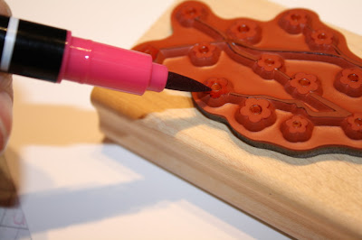
I used markers to put the different colours straight on to the stamp. This is a great way to use multiple colours on a stamp, or to ink up just select portions of a stamp. Best of all, we can now buy the Stampin' Write Markers individually, so you just need to get your most favourite colours!


I inked up the different parts of the stamp using rose red, chocolate chip, and more mustard markers, then stamped off on some spare white card and set it aside for another day. I don't want to waste it after all! I then reinked select flowers, and stamped on my project. This meant that some flowers (the reinked ones) were darker than others, which had already been stamped off once.

A 'thank you' from the short and sweet stamp set, and some earth elements brads (mustard) and it was time for Bridie to wake up. And homework to be done. And dinner to prepare.....

Perfect timing really is short and sweet!

Sunday, May 3, 2009

Making scallops with a Circle Punch

There are a lot of great scallop punches available - circle, square, and of course the scallop edge punch. Sometimes though, these won't do the job. The circle or square may not be the right size. Or perhaps you have a different shape - such as oval, that you want to add scallops too?

Cue your trusty circle punch. Size dependent on the project at hand - for this quick demonstration, I have used a 3/4 inch circle, and an oval of card, cut using a Coluzzle template.

All you need to do is punch out lots of circles, and then apply repositional (non-permanent!) adhesive to the back of your oval (or whatever it is you are 'scalloping'). You only need to put the adhesive around the outside edge of the shape - just enough to hold those circles in place. And then you get to work positioning the circles. This is where the repositional adhesive proves a winner. You can rearrange as much as you like until you are happy with the spacing. (As you can see some of the circles aren't perfect circles, and that is okay because that bit will be hidden anyway!)


This is what it looks like from the front. The scallops are actually even, top and bottom, but the photo was taken on an angle so they don't look it! I have the circles sticking out a long way - kind of petal like. You can stick them down just however you like, with one or more layers of circles/scallops.


The final step is to use a more permanent adhesive. You don't want all that carefully positioning to fall off on the floor! If you want you can do each circle, one at a time, sticking them to the oval, but I am not that patient. Instead, I applied the permanent adhesive to the back of the oval and all the circles, and stuck them on the front of the card. I figured that even though the circles and ovals are attached together 'temporarily', the fact that the circles and oval are attached to the card permanently, should mean that it will all stay intact. So far, so good!


Thursday, April 30, 2009

Stamp-a-ma-jig 101

Today I was playing with the 'All in the Family' stamp set - lots of different heads and bodies to put together however you like. Of course, it is possible to line them up 'freehand', but to be really sure the heads were going to attach to the bodies, I decided to use my stamp-a-ma-jig.


Many of you probably have a stamp-a-ma-jig, and know how to use it, but for those of you who may not, here is a little rundown.


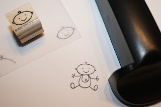
The stamp-a-ma-jig consists of a clear imaging sheet (plastic square), and a black handle. The first thing I should point out is that for this exercise, I am not using the imaging sheet provided. Because most times I use this set, I end up also using the stamp-a-ma-jig, I finally got around to doing something that someone in my SU team once recommended (sorry, cannot remember who - anyone keen to take the credit for this great idea?) I went ahead and made some permanent imaging sheets. I cut a sheet of vellum into squares (7 x 7cm) and in each corner stamped a different stamp, using the stamp-a-ma-jig. That will save time in the future!


So anyway, how to use the stamp-a-ma-jig...
1. I started by stamping the 'baby body' onto my card (I didn't use the stamp-a-ma-jig for that bit).


2. Line the corner of the imaging sheet up with the base of the handle. Stamp the baby head onto the corner of the imaging sheet - making sure to keep the edge of the wooden stamp block up against the corners of the handle.


3. Lay the imaging sheet over the stamped card, and position so that the head attaches to the body.


4. Reposition the handle so that it once again lines up with the corner of the imaging sheet - making sure not to move either the card, or the imaging sheet. ( I should point out here, I am left handed, so often have the handle to the right of the action, and at the bottom of the imaging sheet. It will work with the handle to the right or left, and you can also turn it around so it is at the top of the imaging sheet if you prefer!)


4. When you are happy with the positioning, carefully remove the imaging sheet, taking care not to move the handle, or card.


5. Reink the stamp, and carefully line the edges of the wooden block up with the edges of the handle. Stamp the image.


6. Ta daa! Your stamp is positioned PERFECTLY!


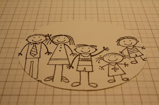
Especially handy when you want to stamp out the whole family.....

and of course, any other time you want to make sure you stamp in just the right spot!
If you feel nervous about stamping straight on to your project (such as a nearly completed scrapbook layout - eek!) then this could be the tool for you.
(this may be the last 'stamp-a-ma-jig' post for a while - what a pain to have to keep writing 'stamp-a-ma-jig' over and over!)

Monday, April 20, 2009

When you were 8, now you are 9...

Here it is. The first of the Arthur Howard picture book inspired projects. (See this post if you have no idea what that is all about!)


This project was a direct CASE of the book (remembering the book was 'when I was five... now I am six...'). It is a double page layout, but one of the things I really like about this idea, is that each page would work just as well as a separate, stand alone layout. I'm going to put them in the album together, but one day down the track, if we want to change it around, we can. That way I also get to count it as two projects. That is important. I need all the projects I can get on the done pile!


So, to the details. The colour of the card and patterned papers is Baja Breeze - I think this may be a happy replacement for the recently retired soft sky that I was rather fond of. The numbers were from the great SU 'Simon Lower' chipboard set- also recently retired (I know, that is not helpful to you, but hey - check me out! I'm using stuff from stash!) covered with the baja paper, then sponged with a little ink around the edges. Letters for the titles were rubons from a pack I got from Warehouse Stationery in Tauranga, a while ago - Color Rubz 'Upper West Side' by Scrapworks. Great value! I will be sad when I finally get to the end of the pack (more stash stuff used though!)

Another paper from the Baja Patterns paper pack was used for the layout background panel, and a third paper was used for the journaling blocks (the lines on the paper made that easier).

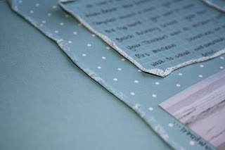
To add a little interest, (and because I was experimenting a bit!) I wet the edges of the patterned papers, and rolled them up to create a border. Wetting the paper first makes it easier to crumple it the way you want, and an added bonus is that when it dries it stays where you put it. I used an aqua painter, but a wet cotton bud will do the job just as well.


These double sided papers were especially good for this technique - you get to see a hint of the reverse, but because the same colours are used it is kind of a subtle effect - not too in your face and distracting.

That was about as complicated as it got. The rockets were cut from a basic grey patterned paper and the dinosaurs were stamped using the prehistoric pals stamp set, and a mixture of old olive and choc chip ink (NZ readers, pretend you didn't read that bit about the dinosaur stamps - hopefully this stamp set will be coming to a mini catalogue near you soon!)

Most of the journaling was in the boxes, but some I added around the outside of the photos and the rocket/dinosaur. I am really liking the idea of journaling that doubles as a frame. I think this is also a good way to get started with handwritten journaling if you are not usually a fan (I used to HATE it!) - somehow it just isn't quite so in your face as a big block of journaling might be.
I think what I like best about this project, is that Hayden got to have some input. Often, other than posing for photos, or saying or doing something silly/funny/clever etc, my kids don't get a lot of input into how the projects get put together. This time it was all about what Hayden's interests and activities were - and who better to tell me what they were than Hayden himself! I really enjoyed seeing him look at the finished project, and see what I had done with his ideas - the things that were important to him. A wonderful reminder of why it is we do this scrapbooking thing!
A little bit of blog stuff to end on - I am still trying to figure out why the heck some photos can be enlarged when you click on them, and some (all of these!) don't. Sorry about that. Any ideas please let me know!

Sunday, April 5, 2009

Another Colour Inspiration Card

Okay.

So I think I am addicted!

All day long I kept thinking about projects made with the colours choc chip, baja breeze, kiwi kiss and white! I really did enjoy doing the colour challenge, so when Bridie decided to have a now rare afternoon sleep, and the boys were going out sledding - it was decided. Another project beckoned!
This time round I used the lovely stamps from the 'Bloomin' with Beauty' set - some of you have used these stamps with me before when we made our tile coasters. Just beautiful for colouring.

For some interest on the background I used the long retired 'french script' background stamp (current equivalent = en francais). For a subtle look, I sponged ink onto the stamp, and then applied light, uneven pressure to the card, repeating several times until I was happy. I wanted it to look a little patchy - partly to hide the fact that I needed to stamp twice to cover the width - still haven't figured out how to do that with a really clear image, and not have the join really clear too!


The main image was stamped on watercolour paper, and I used my blender pens and ink pads to colour it in. The great thing about watercolour paper is that you can worry away at it for a while, and it won't disintegrate like normal card does when it gets wet. (Stamp Club ladies - More on water colouring next month!)
I used the white signo gel pen to emphasise the flower centres, and mounted it to the card front with stampin dimensionals. That extra lift really helps to focus your attention.
Some piercing around the edges, with the help of my trusty mat pack, and a touch more of that kiwi kiss (slowly coming around to it!) - using a circle punch to round off the ends.
TA DAAA!!
Another project down, and I nolonger have the house to myself....
...time to go and fold that big mountain of holiday laundry.


Triple Duty

That's right. These cards are kind of a 'three for one deal'
Firstly, we had some birthdays to celebrate, hence the reason for birthday cards. Second, we have been off on a whirlwind visit to New Mexico - so no posts for a few days. It was time to get back into it. And third, I am finally getting around to taking up the colour inspiration challenge from Kristina Werner. Kristina is a talented lady, who regularly sets these challenges. If you are ever suffering from a creative block, or want to try something new, then this could be just the kick in the pants you need - worked for me anyway!


So this week the colour combo was chocolate chip, new in colours kiwi kiss and baja breeze, and whisper white. I must confess, I am still making up my mind about kiwi kiss, but it worked really well with this combo. It would have been perfect for a masculine card, but as I said already, the mission of the day was birthday cards - for ladies - so I decided to go with the big flower from the Eastern Blooms stamp set and see what happened.


For the first card I inked the stamp up with the baja breeze ink, and then for a little bit of added interest, carefully rolled the edges in kiwi kiss, before stamping on white card. This 'rock and roll' technique is an easy one to do, and you can use as many colours as you like - just remembering to start with the lightest colours and work your way darker, so as not to spoil your ink pads. To finish the flowers off, I stamped a small flower from the same set using the kiwi kiss ink, and popped them together with a half pearl from the pretties kit.


I gently curled up each of the petals and attached the finished flowers to the card front using stampin' dimensionals to give extra lift. The card front was simply layers of kiwi kiss card, some patterned paper from the new Baja Breeze Patterns designer series papers, and a length of the 1.6cm wide chocolate chip grosgrain ribbon, on a choc chip card base. A simple choc chip greeting from the 'sincere salutations' set, and the card front was done. For the inside of the card I quickly added some 'stamped off' flowers in the bottom corner and we were good to go!


The second card came about as a happy accident. Well, not so much an accident, as a by product of card number one. After stamping each of the flowers for the first card, I was stamping the excess ink off on my scrap paper, so I could reink for the next flower, without getting kiwi kiss all over the baja breeze ink pad. That piece of scrap paper got to be looking so pretty!!!


So here it is. A chocolate chip card base, with stamped off 'rock and roll' eastern bloom flowers on white card. Some of the flowers have been stamped off once, and some twice (ink up stamp, stamp on scrap paper, stamp on project, stamp on project again, then reink and repeat!). Once again some choc chip ribbon, a greeting from 'a little birthday cheer', and an inside like the first card. Ready to post!


So there you go. If you feel like a challenge today, check out Kristina's blog. She has past challenges posted still, so if these colours don't appeal, you can choose the colour combo that suits you! I have to say though, I enjoyed working with set colours, that I may not have used together otherwise - a bit like brain gym for stampers!

Tuesday, March 17, 2009

How to Colour Fabric Flowers

As promised, this is how I colour white fabric flowers to match perfectly the colours of my project. You can use the same method to colour ribbon too. Best of all, it is very quick and easy!

What you need:


  • plastic bag (I use a snaplock one, I think because that is what I had the first time I did this - but thinking about it, it probably isn't crucial to have the snappy lock bit! That said, a small clear bag is preferable to the supermarket bag variety).
  • fabric flowers (or ribbon) - these ones are from the Pretties Kit
  • a spray bottle with water (although I couldn't find mine this time so put a couple of drips of water in instead and it worked just fine)
  • ink pad

Step One:


I turn the plastic bag inside out, put my hand inside, and then pat the bag on the inkpad, transferring ink to the bag. Keep in mind that depending on the colour of the ink, you may or may not be able to see the ink on the bag - hold it over a piece of white paper and this may help.


Step Two:
turn the plastic bag back in the right way and give it a couple of quick little sprays of water (or, as mentioned above, if you haven't got a spray bottle for water, I added a couple of drops off the end of my finger, and this seemed to work fine). You don't want a lot of moisture in the bag - just a bit to help the ink transfer evenly. When you have done this add the flower, and wriggle it all around in there. You don't have to put your hands in the bag to do this, just hold the flower through the plastic - I think I forgot to mention that not only is this quick and easy, but also clean!


To start off the colour may appear patchy, but just keep going until it evens out.

Step Three:

Remove the flower and set aside on a piece of paper, or a paper towel to dry off. Because we have only added a tiny amount of water, the flower shouldn't actually be that wet, so should only take a minute or two to dry off enough to use. If you are impatient like me, you could aways try drying it carefully with a heat gun for a couple of seconds. If the colour isn't as intense as you want you may need to repeat the process above.

The flowers in these photos are a pale pink that you won't be recognising

- fresh from an SU box - introducing...

Pink Pirouette - one of the new incolors that are headed our way!

It is so preeettty! Although I don't think it will seen within a mile of a boys project,

It is going to be just perfect for Bridie Isabelle. Luckily there are a couple of other new colours that will go well for the boys, so they won't feel left out at all.

Now my next challenge is to use these flowers on a project to share with you all

(you will notice I am not putting a timeframe on achieving that one!!)