Pages

Thursday, April 30, 2009

Stamp-a-ma-jig 101

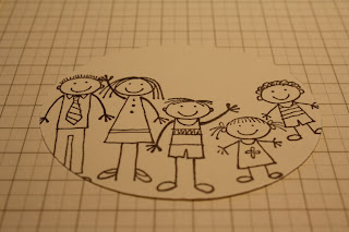
Today I was playing with the 'All in the Family' stamp set - lots of different heads and bodies to put together however you like. Of course, it is possible to line them up 'freehand', but to be really sure the heads were going to attach to the bodies, I decided to use my stamp-a-ma-jig.


Many of you probably have a stamp-a-ma-jig, and know how to use it, but for those of you who may not, here is a little rundown.


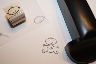
The stamp-a-ma-jig consists of a clear imaging sheet (plastic square), and a black handle. The first thing I should point out is that for this exercise, I am not using the imaging sheet provided. Because most times I use this set, I end up also using the stamp-a-ma-jig, I finally got around to doing something that someone in my SU team once recommended (sorry, cannot remember who - anyone keen to take the credit for this great idea?) I went ahead and made some permanent imaging sheets. I cut a sheet of vellum into squares (7 x 7cm) and in each corner stamped a different stamp, using the stamp-a-ma-jig. That will save time in the future!


So anyway, how to use the stamp-a-ma-jig...
1. I started by stamping the 'baby body' onto my card (I didn't use the stamp-a-ma-jig for that bit).


2. Line the corner of the imaging sheet up with the base of the handle. Stamp the baby head onto the corner of the imaging sheet - making sure to keep the edge of the wooden stamp block up against the corners of the handle.


3. Lay the imaging sheet over the stamped card, and position so that the head attaches to the body.


4. Reposition the handle so that it once again lines up with the corner of the imaging sheet - making sure not to move either the card, or the imaging sheet. ( I should point out here, I am left handed, so often have the handle to the right of the action, and at the bottom of the imaging sheet. It will work with the handle to the right or left, and you can also turn it around so it is at the top of the imaging sheet if you prefer!)


4. When you are happy with the positioning, carefully remove the imaging sheet, taking care not to move the handle, or card.


5. Reink the stamp, and carefully line the edges of the wooden block up with the edges of the handle. Stamp the image.


6. Ta daa! Your stamp is positioned PERFECTLY!


Especially handy when you want to stamp out the whole family.....

and of course, any other time you want to make sure you stamp in just the right spot!
If you feel nervous about stamping straight on to your project (such as a nearly completed scrapbook layout - eek!) then this could be the tool for you.
(this may be the last 'stamp-a-ma-jig' post for a while - what a pain to have to keep writing 'stamp-a-ma-jig' over and over!)

Wednesday, April 29, 2009

In the blink of an eye...

First a confession - this isn't a new project, but I thought I might share it anyway, because it kind of fits in with the 'Arthur Howard' theme I have been running with lately.


A couple of years ago, we were watching Hayden do something, I don't remember what now (good story so far?!) and it suddenly struck me that he was growing up. Fast. When the heck did that happen?! So I asked Peter - when did Hayden get so big? and at the exact same time as he replied 'gradually', I thought to myself - 'in the blink of an eye'. Thoughts that followed this...
  1. Boys and girls see things differently!

  2. Wouldn't that be great for a scrapbook page?

  3. Perfect for the Ali Edwards layout I saw in that mag - now which mag was it...? (for the record, it was Creating Keepsakes, July 2006, p76

Hayden was born pre digital camera - so we have a LOT of actual photos of those first few years. (We have a LOT of photos of Campbell and Bridie too, but they are of the digital variety - not actual prints). Many of those photos are bad, or duplicates, or fuzzy etc - they are never going to feature on a layout of their own. But on a layout like this, they are perfect! Just cut them into circles, size depending on the photo, and you are good to go. There were 14 photos on this layout....


fourteen!


Not to mention some stuff from the stash
(at the time Hayden was 7).

Now this really was a super quick and easy layout - perfect for clearing out those shoeboxes of photos (sorting through the photos was probably the longest bit). A little bit of handwritten journalling around the outside of the page (part journaling/part frame) and there it is - still one of my favourite layouts. Other than a piece of cardstock, and all the photos, the ingredients for this one were simple - some Autumn Leaves rub on lettering, Tim Holtz Design 'H', '7' and tape measure strip, and a black pen.

If you were impressed by the fact that two years on, I could not only remember the ingredients, but also the page number of the magazine that had the original Ali Edwards layout, then I have a little secret. Although I would like to lay claim to a freakishly mega memory, it is pretty clear that that is not the case. It all comes down to what is happening behind the scenes....


Yep, right there on the back of the layout - ingredients, inspiration, and of course the date and a name. Maybe you all do this already, but if you don't, you should start! One day you might need to know that stuff!

Monday, April 27, 2009

A monster of a Kristina Challenge

Time for another of Kristina Werner's colour inspirations. This time she is doing it a little differently - instead of specific SU colours, she has gone with broader colours - brown, red, yellow, turquoise and white. So now it is even easier for us all to give it a go - so off you go - make something!

I was determined to make something, and have been thinking about what I might do. I had a plan that involved lots of flowers. In fact, I had stamped out the flowers, and had just about cut them all out, when the plan changed, and this happened instead...


Cute monsters huh?! It was much easier than the flowers too, - all made with bunches of punches (oh dear, did I really just write that?!) The reason for the plan change? I blame Campbell. He came to see what I was making. After admiring all those flowers, he announced he had made something at school last week and had forgotten to show me. Would I like to see it now? Well of course I would, bring it on! So he did. And here it is...


A little monster. The cutest little monster I have seen in a while. When I told him so he suggested maybe I could make one too, when I had finished with all those flowers. As you can see, the flowers were relegated to the background, and out came the punches - I do love my punches - and some more little monsters were born...


Made by Tracee, and Campbell!

The SU card colours I used for this were Red Riding Hood (new incolour) tempting turquoise, chocolate chip, so saffron, and whisper white. The sentiments, stamped in Red Riding Hood, are from the Family Phrases stamp set. Not forgetting of course - an assortment of punches - 1 3/8" square, word window, 1/4" circle, and the 1/2" circle.


Thursday, April 23, 2009

'Standard' sizes for scrapbook layouts

and more on the A4/letter hybrid, previously referred to as 'this size'
Possibly I am the only one who needs an explanation on this one, but just in case you all think I am going crazy, I am going to explain the thinking anyway!
As you may know - 'standard' card sizes are different in NZ/Aust and America.
In NZ we have 'A4' - 21 x 29.6ish cm (based on a quick measure of the nearest piece of card). In America they have 'letter' - 8.5 x 11 inches. A4 and letter are not the same size. A4 is narrower, and taller than letter. Not by a whole lot, but when your card is A4, and your page protectors are 8.5x11inches, there will be a bit sticking out the top. It will also not be quite as wide as the page protector.
This is where the 'hybrid' comes in. Obviously, having part of the layout, even if it isn't a whole lot (1.5ish cm) sticking out the top of the page protector is not desirable. I trimmed this bit off before I started the layout. This time round I didn't worry about the difference in width. The card was only a little smaller (around 0.5cm) so I figured not enough that it will fall out of the protector. If you really wanted a snug fit, you could add a bit on the side, but, I couldn't be bothered. Instead I have ended up with a layout that is A4 width, and letter height - a hybrid - 'this size'. Is this what other people have done? - or have I just put way too much thought into this one?!

The same thing happens with what I consider the more 'traditional' 12x12 layouts.

In America they have 12 x 12 inches - while in NZ we have 30 x 30cm. We also have 12 x 12, because lots of stuff comes from the US, but, stuff from NZ is often 30 x 30cm.

30 x 30 cm is often refered to as 12 x 12, but it is not quite the same as 12 x 12 inches. (Have I confused you yet?!) 30 x 30 is slightly (about 5mm in both directions) smaller. This would only be a problem if you did 12 x 12 layouts, and then tried to put them in a 30x30 album. I know this because I tried to rearrange my layouts once, and discovered that several wouldn't fit in the nice new album I had bought especially. Darn it! I now make a point of trimming all my 12 x 12 inch layouts to 30 x 30cm, before I start the layout, just in case a rearrange is needed in the future.

I am guessing that if you are in America this is not even an issue - all your supplies will be intended for your market. In NZ, it is only an issue when you are mixing supplies from NZ and elsewhere. And maybe that isn't a problem at all? Maybe it is just me?
Anything is better than folding laundry. Even trimming 5mm off the edges of my layouts!

Before we had kids...

life was different. Very different. Cue another Arthur Howard inspired layout...


This was a fun layout to do, and it was very quick and easy - I suspect you will be seeing a few more along these lines in the future! Although I have done a few mini album projects, all of my album layouts have been 12x12 (30x30cm)... until now. This was the first time I had done a layout 'this size' ('this size' being a hybrid between A4 and letter - I may need a separate post to explain that one!) ANYWAY...


The original plan was for a 12 x 12, and then, as the journaling grew, chatterbox that I am, the plan changed to a double page layout. Next thing I know I am checking how it would look 'this size' , and the 12 x12 plan had been abandoned.
The beauty of this size, and the reason it is suddenly now my favourite, is that you just type out the journaling, and print it on the card. No fiddling about to get it in the right place. No figuring out how to get my computer journalling onto my 12 x 12 card using my A4/letter printer. No cutting. No sticking. Just type and print. SIMPLE.


To add a little interest, and help to break up that big block of journaling, I changed the letter size to emphasize different words or sentences. The 'titles' were the largest size, and I also used a different colour to help them be seen (they maybe could have been a little bit bigger again, but this size is nothing I cannot live with). The first page was life before kids, the second page was life with kids. For both pages I started many of the sentences with 'before we had kids' to help tie them together.


To finish up I added a strip of patterned paper, and a sticker border to the bottom of each page, and then attached the photos on top of that. The photos are all from different occasions, but all show us being big kids. I am thinking I may make a note of dates and locations on the back of the layout, but the front will stay as is - the photos are really just to reinforce the sentiment in the journalling. This way the emphasis can be on the words.
I decided against any additional embellishments - this one is going to be a nice, simple layout. I went through a phase a couple of years ago when lots of my layouts were like this - some computer journalling, straight lines, minimal fuss and bother. They are still amongst my favourite layouts. Combine that kind of simple with 'this size' layout and those albums will be full in no time!

Monday, April 20, 2009

When you were 8, now you are 9...

Here it is. The first of the Arthur Howard picture book inspired projects. (See this post if you have no idea what that is all about!)


This project was a direct CASE of the book (remembering the book was 'when I was five... now I am six...'). It is a double page layout, but one of the things I really like about this idea, is that each page would work just as well as a separate, stand alone layout. I'm going to put them in the album together, but one day down the track, if we want to change it around, we can. That way I also get to count it as two projects. That is important. I need all the projects I can get on the done pile!


So, to the details. The colour of the card and patterned papers is Baja Breeze - I think this may be a happy replacement for the recently retired soft sky that I was rather fond of. The numbers were from the great SU 'Simon Lower' chipboard set- also recently retired (I know, that is not helpful to you, but hey - check me out! I'm using stuff from stash!) covered with the baja paper, then sponged with a little ink around the edges. Letters for the titles were rubons from a pack I got from Warehouse Stationery in Tauranga, a while ago - Color Rubz 'Upper West Side' by Scrapworks. Great value! I will be sad when I finally get to the end of the pack (more stash stuff used though!)

Another paper from the Baja Patterns paper pack was used for the layout background panel, and a third paper was used for the journaling blocks (the lines on the paper made that easier).

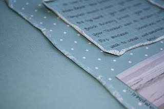
To add a little interest, (and because I was experimenting a bit!) I wet the edges of the patterned papers, and rolled them up to create a border. Wetting the paper first makes it easier to crumple it the way you want, and an added bonus is that when it dries it stays where you put it. I used an aqua painter, but a wet cotton bud will do the job just as well.


These double sided papers were especially good for this technique - you get to see a hint of the reverse, but because the same colours are used it is kind of a subtle effect - not too in your face and distracting.

That was about as complicated as it got. The rockets were cut from a basic grey patterned paper and the dinosaurs were stamped using the prehistoric pals stamp set, and a mixture of old olive and choc chip ink (NZ readers, pretend you didn't read that bit about the dinosaur stamps - hopefully this stamp set will be coming to a mini catalogue near you soon!)

Most of the journaling was in the boxes, but some I added around the outside of the photos and the rocket/dinosaur. I am really liking the idea of journaling that doubles as a frame. I think this is also a good way to get started with handwritten journaling if you are not usually a fan (I used to HATE it!) - somehow it just isn't quite so in your face as a big block of journaling might be.
I think what I like best about this project, is that Hayden got to have some input. Often, other than posing for photos, or saying or doing something silly/funny/clever etc, my kids don't get a lot of input into how the projects get put together. This time it was all about what Hayden's interests and activities were - and who better to tell me what they were than Hayden himself! I really enjoyed seeing him look at the finished project, and see what I had done with his ideas - the things that were important to him. A wonderful reminder of why it is we do this scrapbooking thing!
A little bit of blog stuff to end on - I am still trying to figure out why the heck some photos can be enlarged when you click on them, and some (all of these!) don't. Sorry about that. Any ideas please let me know!

Another Opportunity to join Stamp Club

With one stamp club full, and another finishing up, I have had a few enquiries lately about getting another club up and running. Stamp Clubs are a great way to tick some stuff off your wishlist, while sticking to a budget, and perhaps best of all, it's your chance to get those hostess freebies - a hostess stampset, and a guaranteed mimimum SU $35 credit, without having to actually host a workshop.
In addition to that you will receive a copy of the new catalogue and idea book, a card sample swatch with all the su card colours, to help with planning your projects, and monthly project kits showcasing different product or techniques – all free. I am also planning some product shares in the coming months, that will be available to club members only, to help stretch those dollars even further.
So what do you need to do to get your hands on all those freebies?
The way the club works is you commit to a $45 order each month for eight months (+usual SU post charge of 5%). Your order can be made up with anything from the catalogue, or other specials that I may offer from time to time, such as embellishment shares. One of the eight months you get a turn to receive the hostess freebies – a hostess stamp set and credit of at least $35 (hostess month is based on the order in which participants register). Email me your order, and each month your goodies will be posted out to you. All from the comfort of your home!
If you already find yourself ordering product on a regular/semi regular basis, this is especially good for you - it’s time for you to get your hands on some of that free stuff! So, if you are interested in registering for Stamp Club, or would just like to know a bit more about what is involved – pleased contact me ASAP - tracee.creates@gmail.com
The sooner the places are filled the sooner we can make a start. Please feel free to share this opportunity with anyone else you think may be interested too. We will need eight participants to get the club started. (open to NZ residents only sorry).
Of course, if you would rather host an actual workshop, then please also contact me. I can put you in touch with one of my team who would be happy to come and show you and your friends some of the latest SU goodies.
Okay, time to go and create!

Sunday, April 19, 2009

More Random Thoughts...

It has been a bit quiet around here this week - you may have noticed that already! The cold I thought was going to be easily beaten has come back for another round - cough cough, sniffle sniffle. Whoever invented Codral Colds - THANK YOU! But maybe next time if they could stop the coughing and sore throats that would be good.

One good thing to come from it though - more inspiration. Who knew a box of tissues could be so helpful! Those boxes are just so darn pretty!

Midst the coughing and sniffling I have managed a bit of creating. I have discovered the problem with having all that inspiration, is not only the lack of time, but deciding where to start. Or trying to stick to one project at a time. I have several things that are at various stages of planning and creating, and will hopefully start sharing those during this week. I have completed a double page layout (does it count as two if it is a double page layout?!) so that will probably be first.

We have also been helping Hayden to make a big papier mache peach for his book report presentation (three guesses what the book is). I love it when we can go to the closet/Mum's 'craft room' and find just what we need. Helps me to justify having the stuff in the first place!

Speaking of stuff, don't forget the embellishment shares that I am running - contact me if you would like to take advantage of this offer. You can find all the details in this post.

Now a few more catalogue related comments...
  • You will remember a few posts back I listed some corrections to the new catalogue. I was hoping that would be the end of that, but unfortunately it wasn't. I am pleased that they are now available on the customer SU website - see the link on the sidebar, or click here to go straight to the latest version.
  • I have also added sidebar links for the supplies list for all the projects shown in the catalogue. If you see something you like, you can check here to see exactly what colours and supplies were used to create it. There are two versions - this one has photos and text, while this one is a text only file.
  • Some really good news, is that with this new catalogue SU are making the move to all diecut stamps. Although you will still need to assemble them yourself, you will nolonger have to cut them out first. Although trimming the stamps wasn't difficult, it was a little bit nerve wracking, and certainly time consuming, so I am especially pleased about this. All the new stamp sets are diecut, and all of the stamp sets that have carried over from the previous catalogue will be diecut, once existing 'trim your own' supplies are exhausted.
  • Did you notice that we now have all the stampin' write markers available individually? YAY! I am especially pleased about this. You can still buy the colour family packs if you want (with the exception of the 'in colors'), but if you prefer, you can now get just your most favourite colours. I have heard about a clever way to make your own 'in colour' markers though, so will share that with you some time soon (have to have a little play myself first!)
  • Fingers crossed, it is looking like the shipping delays that we would expect with the end of one catalogue and the beginning of a new one (all those extra orders being placed!) may be finished, and shipping times should be back to 'normal'. There are still some items on backorder, but hopefully they will be arriving soon too.

I am also looking forward to another colour challenge from Kristina Werner coming soon. Why don't you join in too? You don't have to display your project for all the world to see, but I bet you will enjoy it!

(How much am I loving links in this post? Dare you to click on one!)

Told you they were random thoughts! I blame the codral colds.

Tuesday, April 14, 2009

Scrapbooking inspiration

So you know about the colour inspiration challenges that I have recently discovered. While they are great for getting me creating, and, so far, pushing me a little out of my usual colours comfort zone (and that, of course, is a good thing!), they haven't yet helped me get those scrapbook pages finished.

Each new day seems to have new photo opportunities and topics that really should have a page of their own. The list gets longer. The pile of completed pages doesn't seem to grow quite as quickly! (Peter despairs because the computer is jam packed with photos - again! oops!!)


But then a trip to the library provided just the inspiration needed to fill in some more empty page protectors. Now this is not the first time I have found inspiration at the library - I have been known to bring home the odd book about scrapbooking, or photography, in the hope that something might rub off on me! This time though, inspiration was found in the picture book section. The book that Campbell chose to bring home. A great little book by Arthur Howard, called 'When I was Five'


Now, without giving away too much, it is about a boy remembering when he was five - his favourite car, dinosaur, hiding place, best friend etc, and how that has (or hasn't) changed - now he is all grown up (that would be - aged 6).

So who doesn't think that would make a great scrapbook project?


(Bridie likes this book too!)

I am thinking not only good for age comparisons (Hayden - when you were 8, now you are 9), but also looking at a particular age (Campbell - now you are 5 - maybe that backpack mini album he requested a couple of weeks back?!).


Not forgetting the whole 'growing up' theme (Bridie wore a 'Princess pull up' to bed last night. Up until then, she had been in nappies at night. Pullups were on special, so cheaper, and I thought to myself - the girl is growing up - why not make the move to pull ups?' Probably more than you ever needed to know - but the look on her face, she was so proud of herself! Making that transition from baby to little girl (or big girl, as she prefers to be known!) - if that isn't worthy of a scrapbook page I don't know what is.

And then there could be the special milestone birthday projects - 5, 13, 21, 40.....

Or other comparisons...

  • primary school versus secondary school
  • living 'here' versus living 'there'
  • country kid (Peter and I both grew up on dairy farms) versus town kids (our children are true townies - I was a little sad the day that thought dawned on me - I think we were visiting a farm and they complained of the smell...)
  • before I had children (my house was oh so quiet!!) compared to the bliss/chaos/noise of motherhood .....
  • how about some inter-generational comparisons - whose grandfather (or father?!) didn't have to walk x miles (pre-metric days of course) to school, rain or shine, with no shoes? Back in the dinosaur days. Good times!
  • life before the internet/microwave/dishwasher etc. My how times have changed - and that's just in recent years!

Making this list has just reminded me of this layout, done a couple of years ago. Not the greatest in the world, but it fits this particular theme - who knew how different doing the laundry would be with a baby girl in the house!!

So I am thinking that this particular source of inspiration should be good for quite a few projects. Now I just need to find a way to fit more hours in the day. And more quiet.....

My plan is to be working on these projects, in amongst what ever else comes along, and sharing them with you. My hope is that if you are in need of inspiration then this could help. Arthur Howard may be the new Ali Edwards. Or maybe not quite. Might have to see what actually comes from all of this before we make that call. But still, who would have thought one little picture book could provide us with so much scrapbooking potential?!

If 'When I was Five' by Arthur Howard doesn't inspire you, check out some other picture books. You may find just what you were looking for. If nothing else, you may find a new colour combo! Don't forget to let me know about your inspiration, and resulting projects!

Monday, April 13, 2009

Embellishment share time...

because we all know it's good to share, and because our wishlists are long, and our budgets may not be, and sometimes you just need a few, not a whole pack, and for lots of other reasons too .....
Let the sharing begin!

Share #1 - Designer Brads (as pictured below, and p148 of the catalogue)
Price per share - $14.60 ($29 for a double share)
There are four great new brad designs - flowers, filigree, circles and stars - each design is normally $14.65 including 5% postage, for a total of 16 brads (eight of each size shown, plus 16 mini brads with the filigree design). If you are like me you want them all!
The way this share will work is that each person will pay for just one pack of brads, with four people per share. You will then receive a mixed brad pack, with two of each design shown - a total of 16 designer brads, and the four little brads that come with the filigree brads. Of course, you will get the container to store them in too - that will make life easier!
Share # 2 - Flower Fusion (see page 144 of the catalogue, or picture below)
Price per share - $12.60

The Flower Fusion pack would normally cost $37.75 including 5% postage, for approximately 130 felt flowers. They come in 14 different flower designs, as shown, and a mixture of three colours - Pumpkin Pie (pictured), Rose Red, and Old Olive. Yum, yum, yum.

The way that this share will work is that each pack of flowers will be divided between three people, with the cost also being shared between three. You will receive a bag of approximately 42 flowers - including each of the 14 designs shown, in a mixture of pumpkin, rose red and olive. (The tin is not included in this share, because, well, one tin between three just doesn't work).

Share # 3 - Flower Fusion Too (see page 144 of the catalogue)

Price per share - $12.60

exactly the same as share #2, but with different colours. The felt flowers in this share are pink pirouette, baja breeze, and chocolate chip. Flower Fusion Too has the same 14 flower designs (as shown above in pumpkin), and once again, you will get a mixture of all 14 designs, and all three colours - approximately 42 total.

For all of these shares, the order will be placed when all the shares are taken. For this round of shares, they can be included as part of a stamp club order. If you are interested please contact me ASAP either on my usual email address, on my new stampy email - tracee.creates@gmail.com

Oh, and just a little reminder - these shares are only open to people in New Zealand.

Now I am hoping this all makes sense. My head is a little fuzzy today. It makes sense in fuzzy world, but if you have questions, please contact me.

I will have some more shares coming soon, including ribbons and 'onboard' embellishments. I am thinking about designer papers too - but I prefer to keep those at 12 x 12 size as I think that is more versatile than a smaller sample, so still thinking on that one. Do remember you can easily organise your own shares for these though - just go halves with a friend!

Saturday, April 11, 2009

Colour Inspiration #49

Kristina Werner has another 'color inspiration' challenge up, and at this rate, Kiwi Kiss is looking like becoming my most used colour!

I have been thinking about what to do for the past couple of days. Doing would have been better, but there was other stuff that needed to be done, so thinking was the next best thing. In my mind there were butterflies, and crystal effects - a truly beautiful creation! Today there is time for doing, but I woke up feeling yucky, so the butterflies are waiting for another day, and quick and simple it is. And using up scraps....


Told you it was quick and simple! Black wouldn't normally be my first choice for a birthday card, but it was a great background for those bright strips of card. The only stamping is the sentiment from 'A Little Birthday Cheer'. I started off with it stamped in black, but it was looking a little flat, so I switched to Pacific Point, and it worked a lot better.


When your card is black, you do need a little something on the inside, just so you can see the writing! A few little scraps of card stuck down the side of some white, and it is ready to go (of course, you could write with a white pen, but then you wouldn't get to do this!). Just quietly, I think this might be my favourite part of the whole card.

And that is that. Told you it was quick and simple! Might get to those butterflies in the next day or two - or maybe I'll save them for the next colour challenge...

I have got some information to post about some embellishment shares. Keep an eye out later today, or perhaps tomorrow, depending on the sniffles.

Thursday, April 9, 2009

about that stampin' up sign...

'How do you spell Stampin' Up Mum?' Campbell asked me a few weeks ago.

'Why do you want to know that?' I asked right on back.

'It's a surprise' he replied.

Well Okay then.

S.. T.. A.. M.. P.. I.. N.. U.. P

A couple of the letters, were 'like in Campbell', and a couple of the letters required a little reminder - Mum writing it first on the tiniest scrap of paper.

And then that was that.

No more mention of it.

Until a couple of hours later I went into the bedroom, and noticed the closet door was shut.

And that there was a post it note on the door....

Campbell had made me a sign.

Now as you regular visitors will have noticed - I have been lacking a pretty picture at the top of my blog since, well, since this blog became official. In fact, the search for just the right pretty picture, was a major source of delay in getting started. It's tough. I really like the look of the photo on the 'family blog', but maybe this one should at least have something to do with craft?

In the end I decided that if this blog was ever going to get off the ground I needed to just do it already, and the pretty picture could wait a day or two. Trouble is, once started, it was easy to forget that pretty picture, while I thought about other things instead.

So I figured that for now, while the search continues, there would be nothing more perfect, than a special surprise sign that my baby boy made for me (okay, he's five now, but he's still my baby!) Thanks Campbell!

Monday, April 6, 2009

new pjs

So I think I have about 100 birthdays and other special events waiting to be scrapbooked, and yet somehow, Bridie's new pyjamas made it to the top of the scrapbook to do list.
Actually, I can tell you how that happened. The arrival of Bridie's new pjs, and her resulting obsession, coincided with the arrival of my brand new 'on board so tweet', fresh from the new SU catalogue. Six sheets in the pack - enough birdies to make a lot of pj layouts. And I especially like those branches that you see below, they could be fun.
If you don't have a whole lot of birdy pj photos, remember there are enough pieces in the pack to easily divide between two - four people (and better on the budget too!). See page 146 of the new NZ catalogue for a peek at all the pieces.
The So Tweet chipboard birds were a little fiddly, but not difficult to use. This time I covered them with card - paper would have been a bit easier to use, but I didn't have paper in those colours, so card it was. I did use versamark ink and some background stamps to clear emboss a bit of interest on some of the chipboard pieces. After I had used a craft knife to trim the card from around the chipboard, I used sponges to ink around all the edges - just to help hide any of the bits that may have been a bit wobbly.


I am really loving the ABC alphabet sets at the moment. This time it was the lowercase version for the title - I love the nice clean lines. A little bit of journaling to explain the pj obsession, and stick it all together. To finish up I sponged around the outside of the layout - pink pirouette ink on pirouette card, for a nice subtle look.


Ingredients for this one:
  • Card - Pink Pirouette, Pretty in Pink, Rose Red, Baja Breeze and Whisper white
  • Ink - Pink Pirouette, Rose Red, Baja Breeze, and Versamark
  • Rose Red and Regal Rose Stampin' Write Markers
  • Clear Embossing Powder
  • Stamps - Boho Backgrounds, Sanded, ABC Alphabet Lower
  • Sticky Strip and Sponges
  • On Board So Tweet - (birds and hearts)

Sunday, April 5, 2009

Another Colour Inspiration Card

Okay.

So I think I am addicted!

All day long I kept thinking about projects made with the colours choc chip, baja breeze, kiwi kiss and white! I really did enjoy doing the colour challenge, so when Bridie decided to have a now rare afternoon sleep, and the boys were going out sledding - it was decided. Another project beckoned!
This time round I used the lovely stamps from the 'Bloomin' with Beauty' set - some of you have used these stamps with me before when we made our tile coasters. Just beautiful for colouring.

For some interest on the background I used the long retired 'french script' background stamp (current equivalent = en francais). For a subtle look, I sponged ink onto the stamp, and then applied light, uneven pressure to the card, repeating several times until I was happy. I wanted it to look a little patchy - partly to hide the fact that I needed to stamp twice to cover the width - still haven't figured out how to do that with a really clear image, and not have the join really clear too!


The main image was stamped on watercolour paper, and I used my blender pens and ink pads to colour it in. The great thing about watercolour paper is that you can worry away at it for a while, and it won't disintegrate like normal card does when it gets wet. (Stamp Club ladies - More on water colouring next month!)
I used the white signo gel pen to emphasise the flower centres, and mounted it to the card front with stampin dimensionals. That extra lift really helps to focus your attention.
Some piercing around the edges, with the help of my trusty mat pack, and a touch more of that kiwi kiss (slowly coming around to it!) - using a circle punch to round off the ends.
TA DAAA!!
Another project down, and I nolonger have the house to myself....
...time to go and fold that big mountain of holiday laundry.


Triple Duty

That's right. These cards are kind of a 'three for one deal'
Firstly, we had some birthdays to celebrate, hence the reason for birthday cards. Second, we have been off on a whirlwind visit to New Mexico - so no posts for a few days. It was time to get back into it. And third, I am finally getting around to taking up the colour inspiration challenge from Kristina Werner. Kristina is a talented lady, who regularly sets these challenges. If you are ever suffering from a creative block, or want to try something new, then this could be just the kick in the pants you need - worked for me anyway!


So this week the colour combo was chocolate chip, new in colours kiwi kiss and baja breeze, and whisper white. I must confess, I am still making up my mind about kiwi kiss, but it worked really well with this combo. It would have been perfect for a masculine card, but as I said already, the mission of the day was birthday cards - for ladies - so I decided to go with the big flower from the Eastern Blooms stamp set and see what happened.


For the first card I inked the stamp up with the baja breeze ink, and then for a little bit of added interest, carefully rolled the edges in kiwi kiss, before stamping on white card. This 'rock and roll' technique is an easy one to do, and you can use as many colours as you like - just remembering to start with the lightest colours and work your way darker, so as not to spoil your ink pads. To finish the flowers off, I stamped a small flower from the same set using the kiwi kiss ink, and popped them together with a half pearl from the pretties kit.


I gently curled up each of the petals and attached the finished flowers to the card front using stampin' dimensionals to give extra lift. The card front was simply layers of kiwi kiss card, some patterned paper from the new Baja Breeze Patterns designer series papers, and a length of the 1.6cm wide chocolate chip grosgrain ribbon, on a choc chip card base. A simple choc chip greeting from the 'sincere salutations' set, and the card front was done. For the inside of the card I quickly added some 'stamped off' flowers in the bottom corner and we were good to go!


The second card came about as a happy accident. Well, not so much an accident, as a by product of card number one. After stamping each of the flowers for the first card, I was stamping the excess ink off on my scrap paper, so I could reink for the next flower, without getting kiwi kiss all over the baja breeze ink pad. That piece of scrap paper got to be looking so pretty!!!


So here it is. A chocolate chip card base, with stamped off 'rock and roll' eastern bloom flowers on white card. Some of the flowers have been stamped off once, and some twice (ink up stamp, stamp on scrap paper, stamp on project, stamp on project again, then reink and repeat!). Once again some choc chip ribbon, a greeting from 'a little birthday cheer', and an inside like the first card. Ready to post!


So there you go. If you feel like a challenge today, check out Kristina's blog. She has past challenges posted still, so if these colours don't appeal, you can choose the colour combo that suits you! I have to say though, I enjoyed working with set colours, that I may not have used together otherwise - a bit like brain gym for stampers!